Rstats

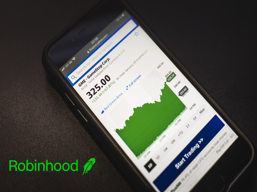
Analyzing Brand Sentiment with Robinhood, Gamestop & R

Brands are essential. They live in our minds as ideas and each person constantly interacts with hundreds of brands a day, sometimes positively, sometimes negatively. But what is their role in data science? Well given most tech is fueled by strong business brands, it is probably essential for any data scientist to have even a basic an understanding of brands. In this post, I want to explain how to do a simple brand sentiment analysis using Twitter.

Continue reading

Visualizing the Proportion of Women In Governments Around the World

Happy International Women’s Day! In the spirit of the day, I wanted to do a post celebrating the many wonderful women of this world. In keeping with my political analytics topics, I thought it would be interesting to look at the proportion of women are in government by country, and how that has changed over the past few decades. Luckily The World bank has such a dataset, measuring the proportion of government seat’s held by women in every country throughout the world.

Continue reading

Mesmerize Your Readers With Animated Graphs & GIFs in R

In my last post, I demonstrated how you can create graphs and text that tell a nice story about how much the American public approved of each of the past 14 Presidents! So, how about we make the information more fun to watch? Luckily, R can accomplish this. With the gganimate and magick packages, GIF building is easy and effective. Let’s look at the end result first, so I can reel you into making this for yourself.

Continue reading

Storytelling With Your Graphs In R Using ggplot2

A few weeks ago, I tuned into an RStudio talk by John Burn-Murdoch about reporting and visualizing the COVID pandemic. As a data journalist at the Financial Times, he has been extremely influential over the past year creating well-known charts and graphics about the spread of COVID and it’s toll on the world. And it is all because his graphics tell a story. As a consultant, I know the importance of storytelling, but doing it in programming is difficult as the story often gets lost behind the data.

Continue reading

Animating England's Lockdown Tier Maps in R

Since October, the UK’s COVID-19 strategy has been defined by the government’s Lockdown Tier system. Different regions, councils and cities have had their lockdowns change from Tier 1 - Medium Alert to the newly introduced Tier 4 - Stay At Home. Now everybody is in a national lockdown, but people all over the country continuously had trouble keeping track of what tier they were in, and what restrictions they had to abide with.

Continue reading